Improving the Program Launch Experience
Company
TogetherTimeline
2020 Q4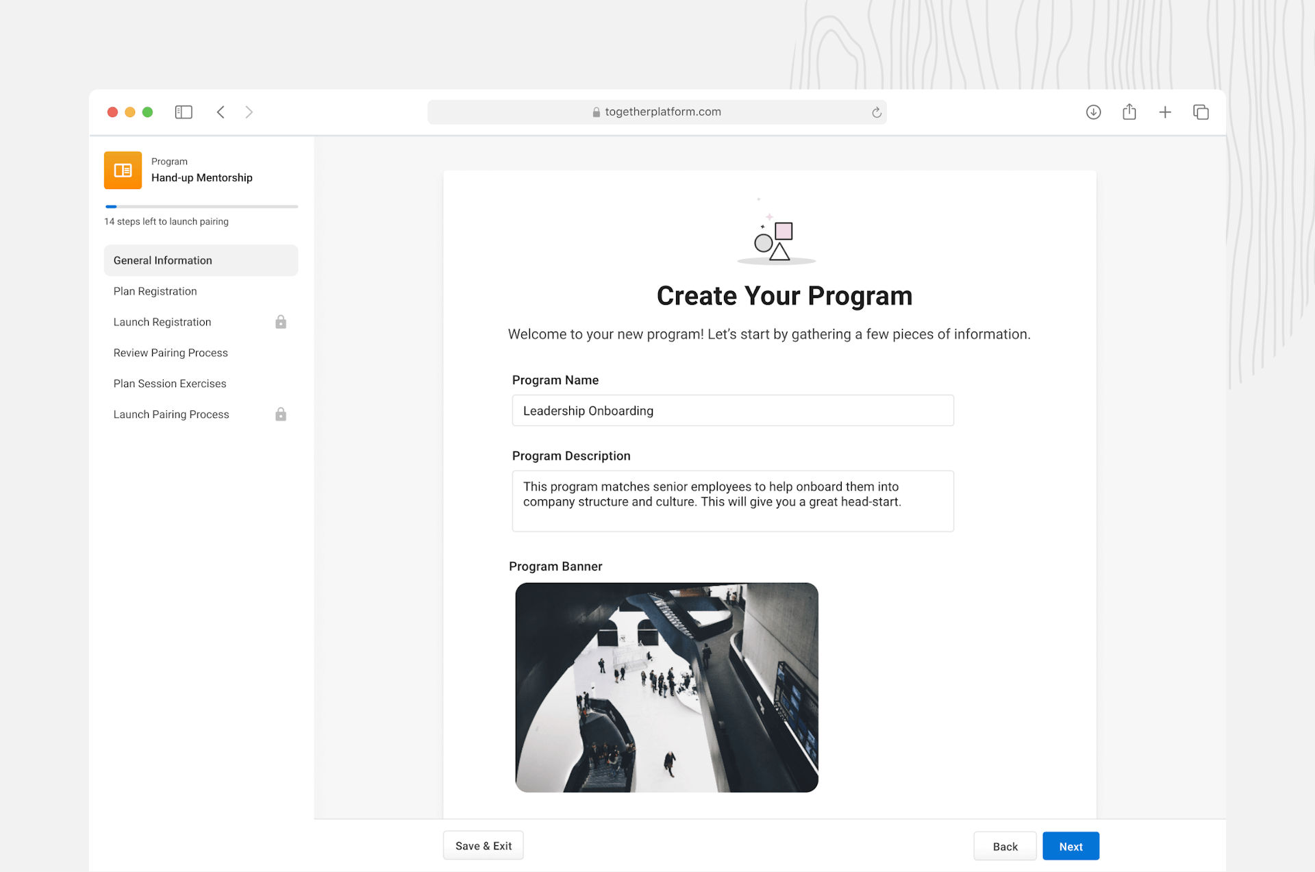
Together sells a white-label product that helps Learning & Development teams at large companies run internal mentoring programs. We help with everything from marketing the program to measuring the quality of mentorship connections made. Our customers include AirBnb, Heineken, 7/11, the UN, Disney, and 80+ other organizations.
Customers often buy us after they've tried to run their own mentoring program using Google forms, then realize how difficult it is to pair everyone up, provide guidance, and measure the success of their program. Most of our major customers are enterprise, which means they need a lot of flexibility and customizability.
To date, I've designed and iterated ~90% of the administrator and end user applications — with some help from some awesome student interns!
The Project
In Q4 of 2020, we worked on a large project (broken into a number of smaller projects) with the goal to improve how administrators launch mentorship programs. At this point the product was almost two years old, and we had about 30 customers. We set out to help our administrator user to create their program, launch registration, and get users paired together faster, easier, with more confidence, and less critical errors.
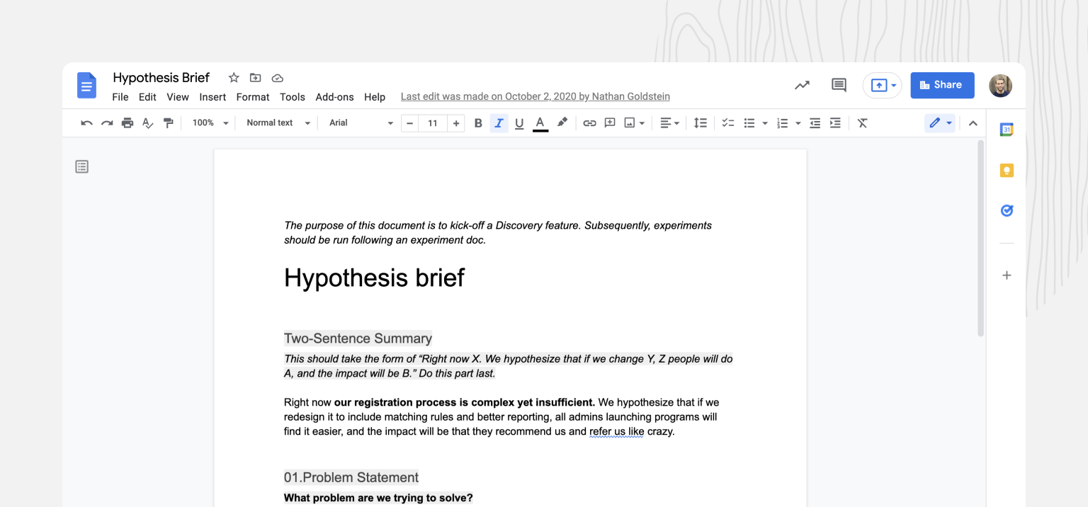
Nathan, the co-founder and head of product, leads the kickoff of our projects with a **Hypothesis Brief **that we work on together. This product document signified the beginning of the Discovery phase of our project.
We kick this Google doc back and forth with each other to iron out details, gather additional data, clarify problems, and gain confidence. Once we're happy, we bring it to our engineering team to start collaborating on solutions.
Why did we work on this
We were suffering from experience rot
Experience rot happens when new features get added in ad-hoc, outside of the vision of the initial design. As a two year old startup we’d quickly shipped features as customer needs arose and glued them in. It was confusing for admins to find the features they needed to launch a program. It was leading to embarrassing mistakes.
Reduce & avoid customer churn
Improving the “first time user experience” helps with retention. Administrators were having a bad experiences launching programs, we worried about churn. We had unhappy customers that we wanted to turn into happy customers who would shout our praises from the top of a mountain.
Manual onboarding was no longer scalable — costing time & money
Manual onboarding was costly for us since it took a lot of our founder and CS teams' time over multiple onboarding calls — this was especially bad for smaller customers because sometimes the time we spent cost more than their contract value. We were winning RFPs and acquiring customers faster than we had before. We knew we had >10 launches coming in the next few months, and wanted to get better onboarding in place so our CS team could focus on value-add for customers, not product training.
Improve revenue by launching more programs faster
We get paid based on** # of active pairings**. If admins can launch more programs more easily, then we can expand internally throughout existing customers, and also launch new customers faster. Faster timelines means we get paid earlier.
Constraints
Timelines & Delivery Goals
We wanted to focus on the entire program launch experience, but as an early stage startup, we also wanted to ship incrementally, so that our users could use new features as we built them. We had 3 months to finish as much as we could, with a handful of engineers.
We had **existing features **we could leverage that were functional, but needed iteration and improvements in how they were organized and pieced together.
Team
At the time, our team was comprised of 1 designer, 1 co-founder PM, 2 engineers, and 7 full-time employees total. We were small, scrappy, and needed to balance all of our customers HRIS integrations, customer requests, and product bugs while building new features.
Research Inputs
Most of our initial research came from working with customers directly, and analyzing their experience in product training sessions. We had low volume of admin users, so qualitative data was more helpful.
Problems
Problem #1 — Lack of guidance in the user experience
- Features were there and worked, but there was little guidance
- Users navigated to 5-6 different places to accomplish core tasks
- No clear indicator of progress — users complete launches over the course of several weeks, so this is especially needed
Problem #2 — Admins take months to launch
- Unsure of best practices of questions to ask and algorithm rules to use to suggest pairing recommendations
- Overwhelming amount of work compounded by unclear steps in process
- Procrastination / lack of motivation — it's a lot of work to run a program!
Problem #3 — Some existing features needed an iteration
Features we had launched quickly to get user value had usability issues — big and small. While customers got the value out of the feature and it worked, sometimes it lead to minor problems, and sometimes it lead to critical errors. For example:
- Working with the questionnaire was cumbersome and admins had trouble using some question types
- It was difficult to reorder questions, meaning admins would delete and recreate questions
- Email issuesAdmins would forget to edit email templates and send emails without having proofread the copyIt was unclear which emails would send and when, leading to** **accidental email blastsNo confirmation of emails sent, so admins never knew if emails were delivered, or if users had received them
- Issues setting program permissions accurately, some users were accidentally blocked from joining programs when they shouldn't be
- Unclear which pairing process to use — admin led? or mentee led?
Problem #4 — Some features were missing in the user journey
Some parts of the user journey we hadn't quite solved for yet, which would require net new features. For example:
- Hard to know what questions to ask users during registration, no clear set of default suggestions
- Some question features weren't functioning properly — like making a response to a question required
- Algorithm rules were read-only and needed to be changed manually by our engineering team in the backend
- Admins didn't know when they had the right amount of mentors and mentees registered. Sometimes there would be too few mentors for the number of mentees. They needed analysis and reassurance of when they would be ready.
How did we know we had these problems?
We had a high degree of confidence in the problems in our product. Nathan our head of product and I looked at evidence from a few areas:
- Customer support requests channel and FullStory **sessions **— This was a great place to mine information! Lots of admins would message us on Intercom as they were launching their programs. We'd sometimes reference issues with FullStory session data, to uncover user issues. Since we were a small team, we all talked to customers through Intercom, until we hired our CS team.
- Onboarding Sessions — We had experience from onboarding our existing 20 or so customersNathan, head of product had been onboarding customers and launching programs since the start of the companyI had also onboarded a some smaller customers onsite during YC in CaliforniaI sat in on current customer onboarding sessions with our new CS hire
- Scrappy user testing — I'd tested program creation flows internally with new hires, people from our co-working space, as well as some HR leaders sourced from userinterviews.com. We watched people struggle and not complete tasks.
Solutions
Design Process
Projects are different and require different parts of the process, but I generally work through each of these steps:
- Read, critique, contribute to product kickoff docGather more data if needed
- Generate artifacts for team to understand the problem better
- Design kickoff workshop to generate ideas (if necessary)
- Generate solution flows & designs
- Critique > Iterate
- Start building when team feels confident and ready
- Test & give design feedback on production work 🔥 Pull branch & ship fixes directly to branch — if I have the time
- Ship to prod
- Monitor on Amplitude, FullStory, Sentry, Support Channels
User Journey Maps
Before carving out solutions, I took a 10k foot view of our administrator’s user journey, task flow, and experience based on everything I'd learned. This became a useful tool for us to align the team and prioritize projects against.
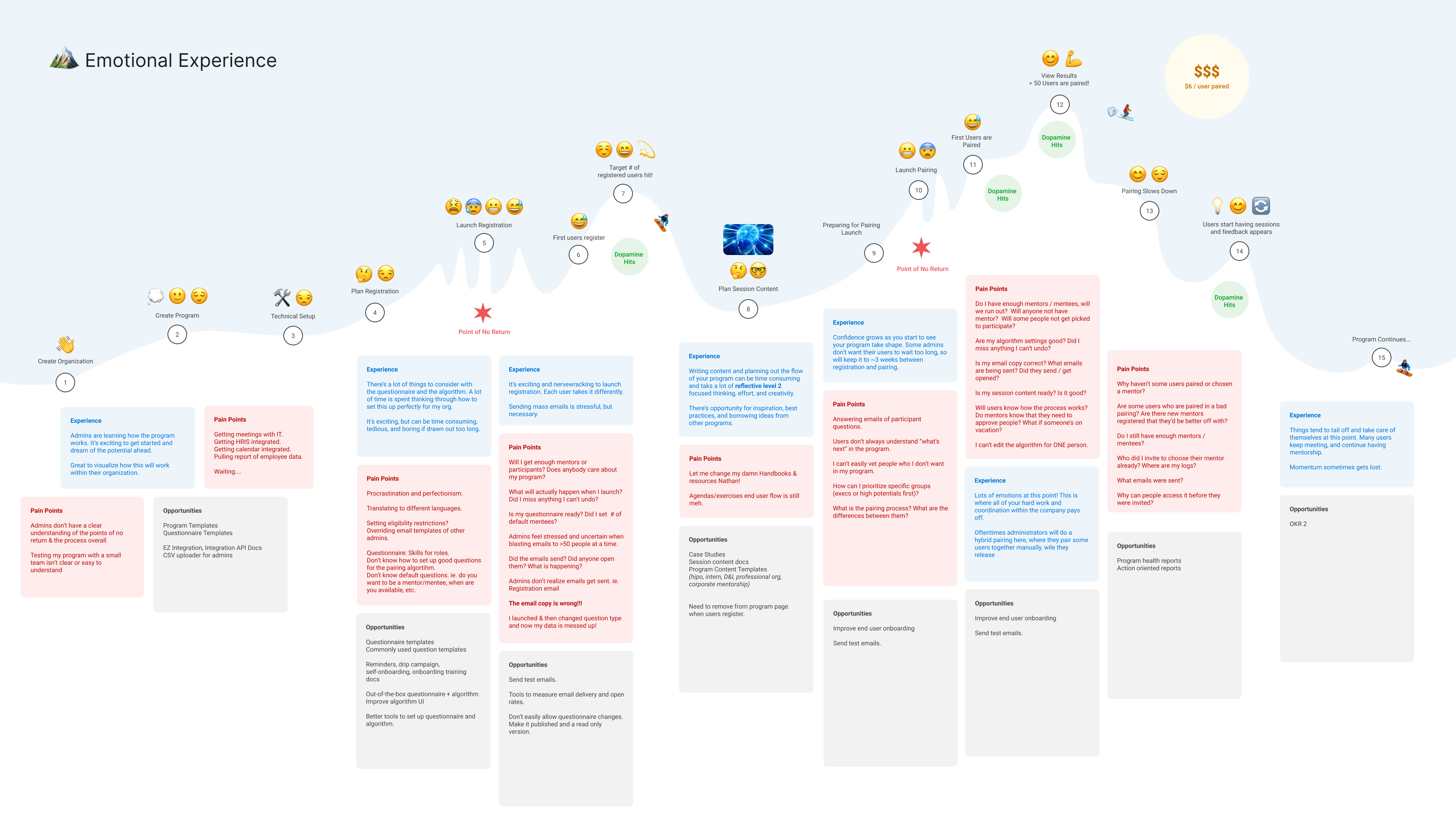
I mapped out the emotional experience that admins were having during the process, based on on anecdotes of real experiences I’d learned about. This helped us understand the tasks admins needed to complete and empathize with their emotional experience. The empathy built helped weigh in on how we prioritized fixes.
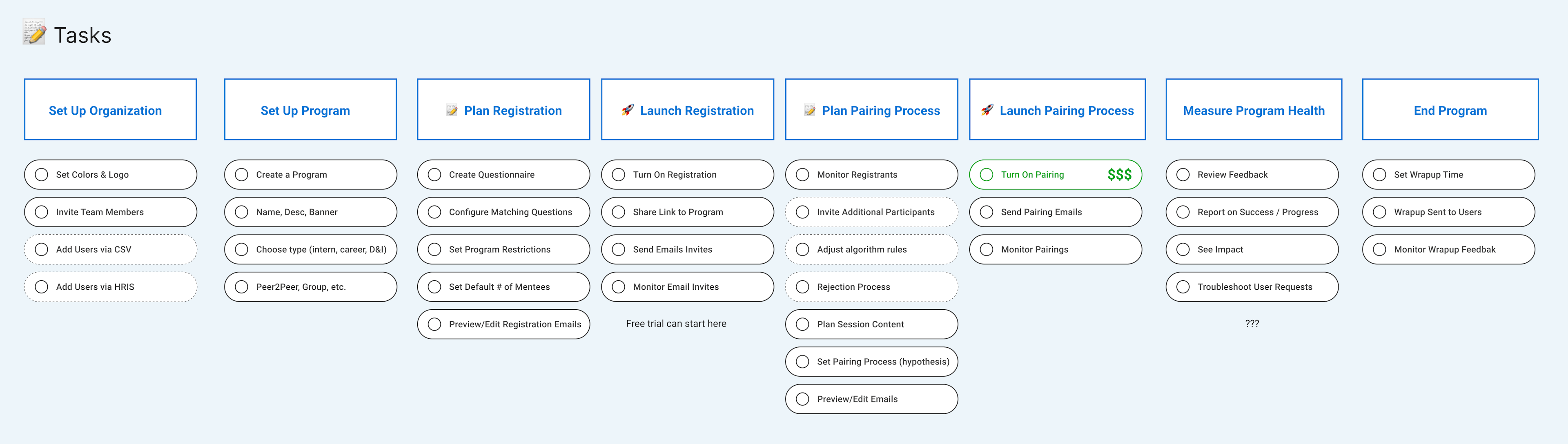
I also mapped out all of the tasks that admins needed to complete in the process. It helped our team to start thinking of a program launch as a series of steps in a funnel that we needed to optimize.
We established 3 desired states across the launch experience:
- Program is created
- Users are registered
- Pairings are created
Flows, Systems, & UI Designs
I spent some time working through lo fidelity designs with my PM, Nathan. Through discussions, sketching, and quick iterations, we settled on a 4 part system that would provide the foundation on which the designs would live.
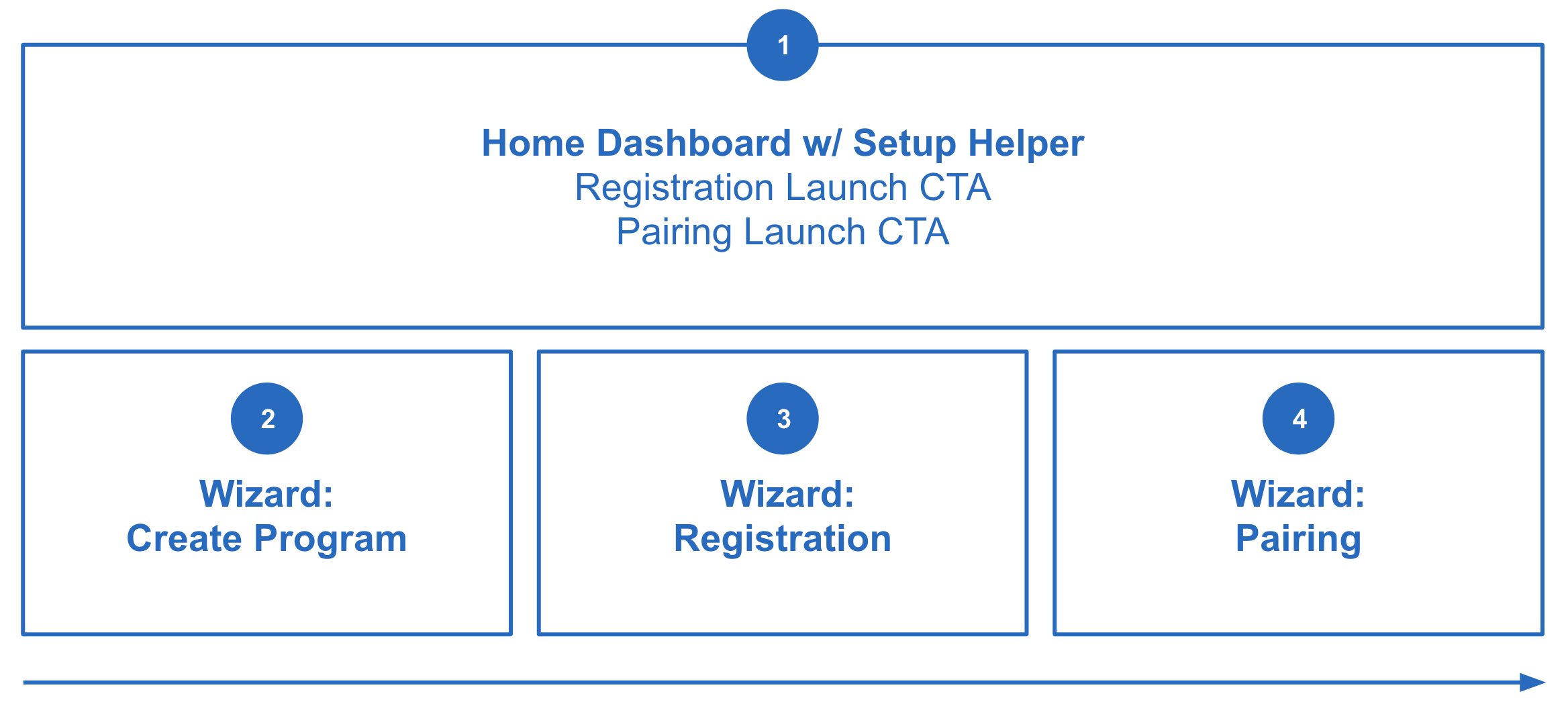
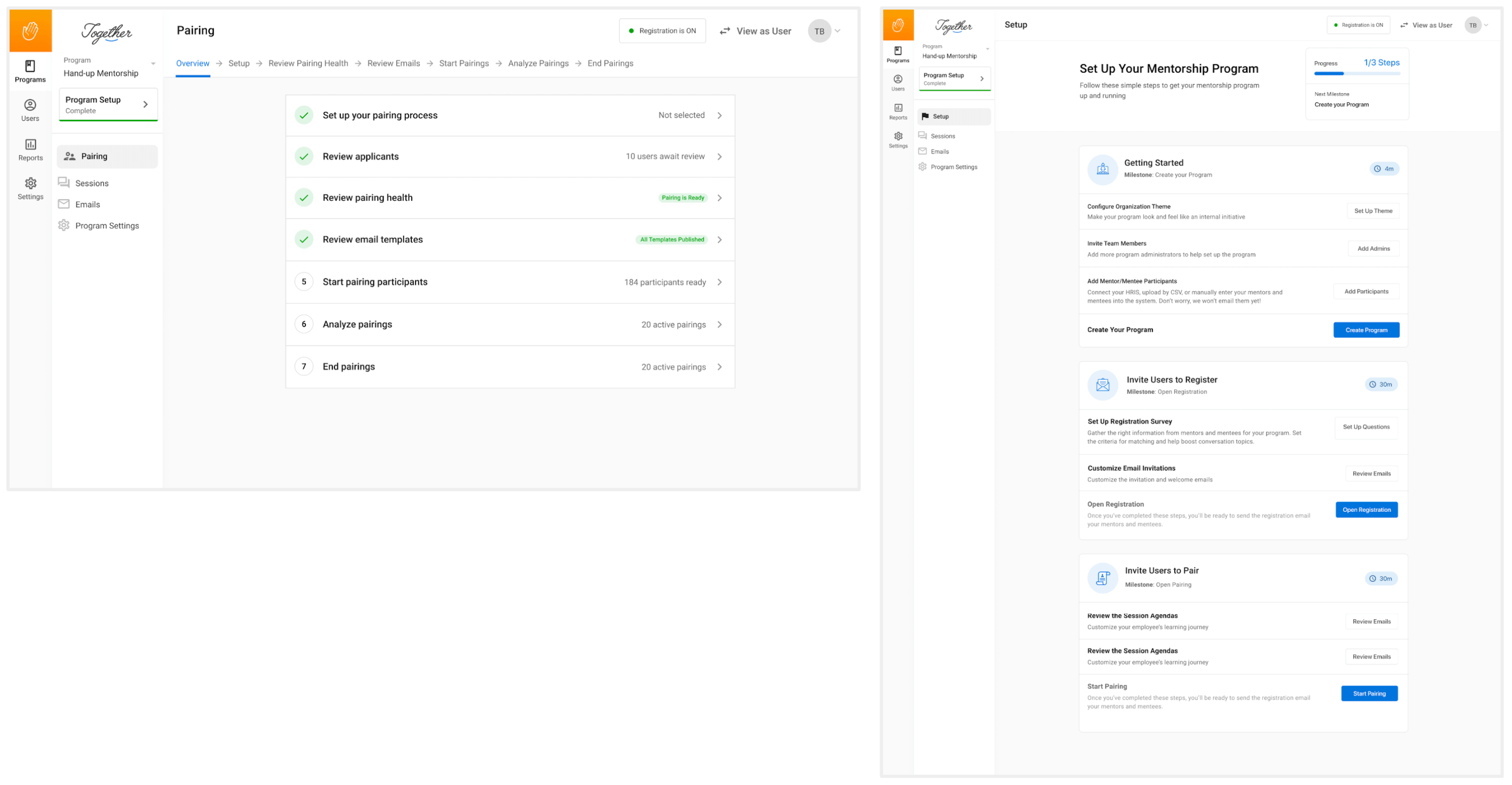
Pt 1/ Homepage Dashboard & Setup Helper
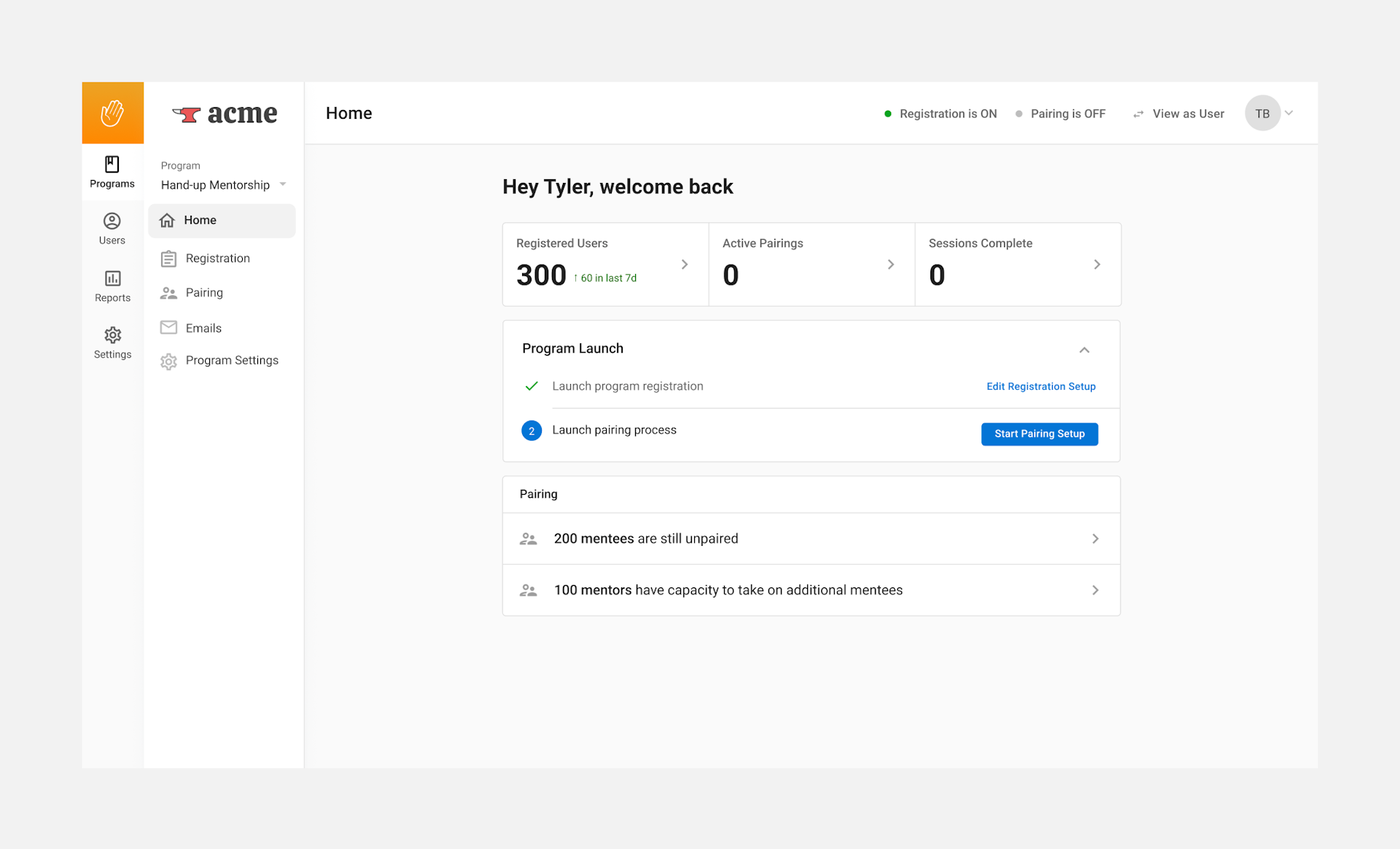
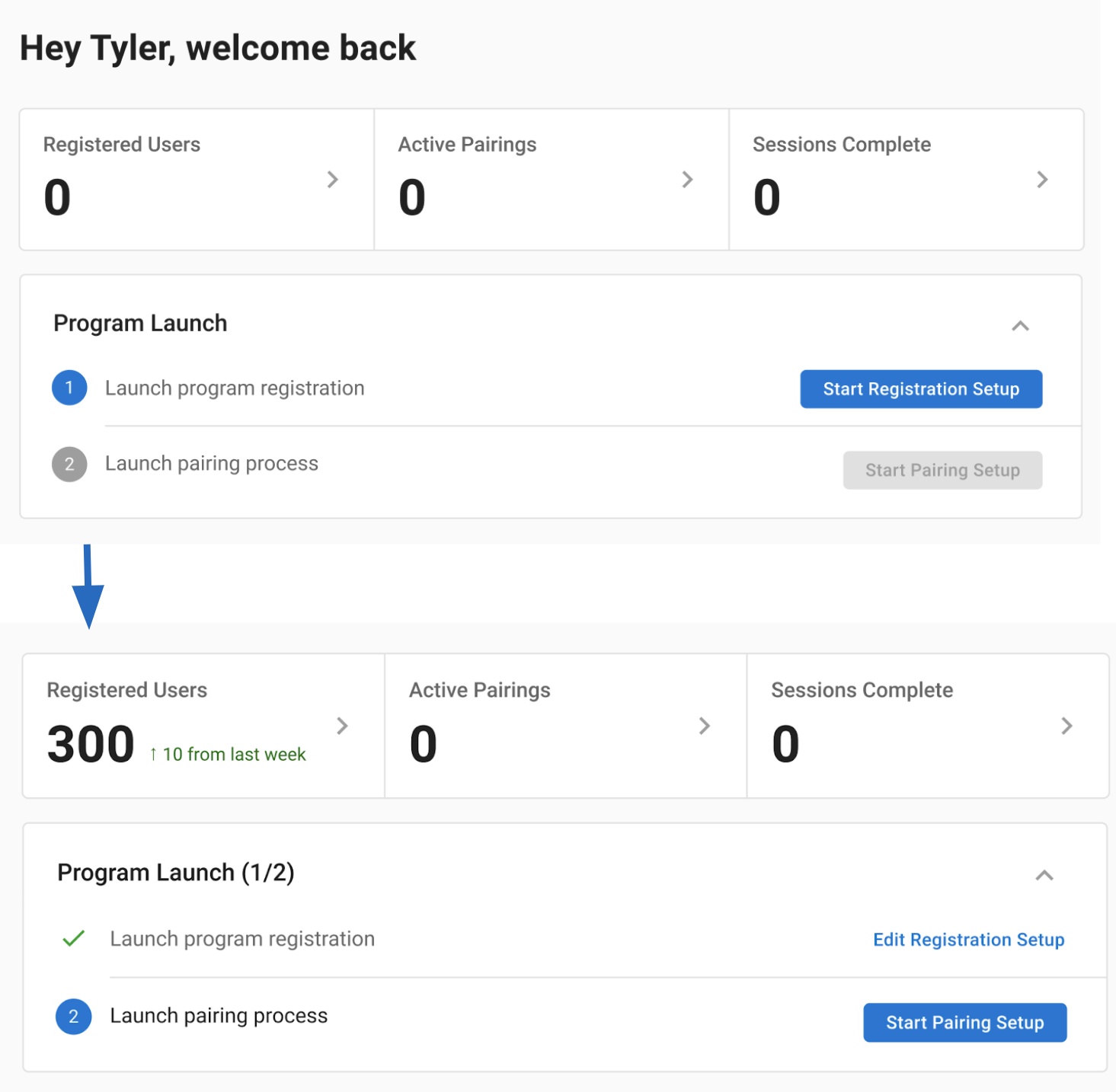
- The data ticker shows progress towards an admin's goals (registration, pairings, sessions)
- The setup helper shows progress of what admins have completed
- The CTA shows the next expected step to complete
- Wizards are easily accessed from this screen, and admins can edit past steps completed too
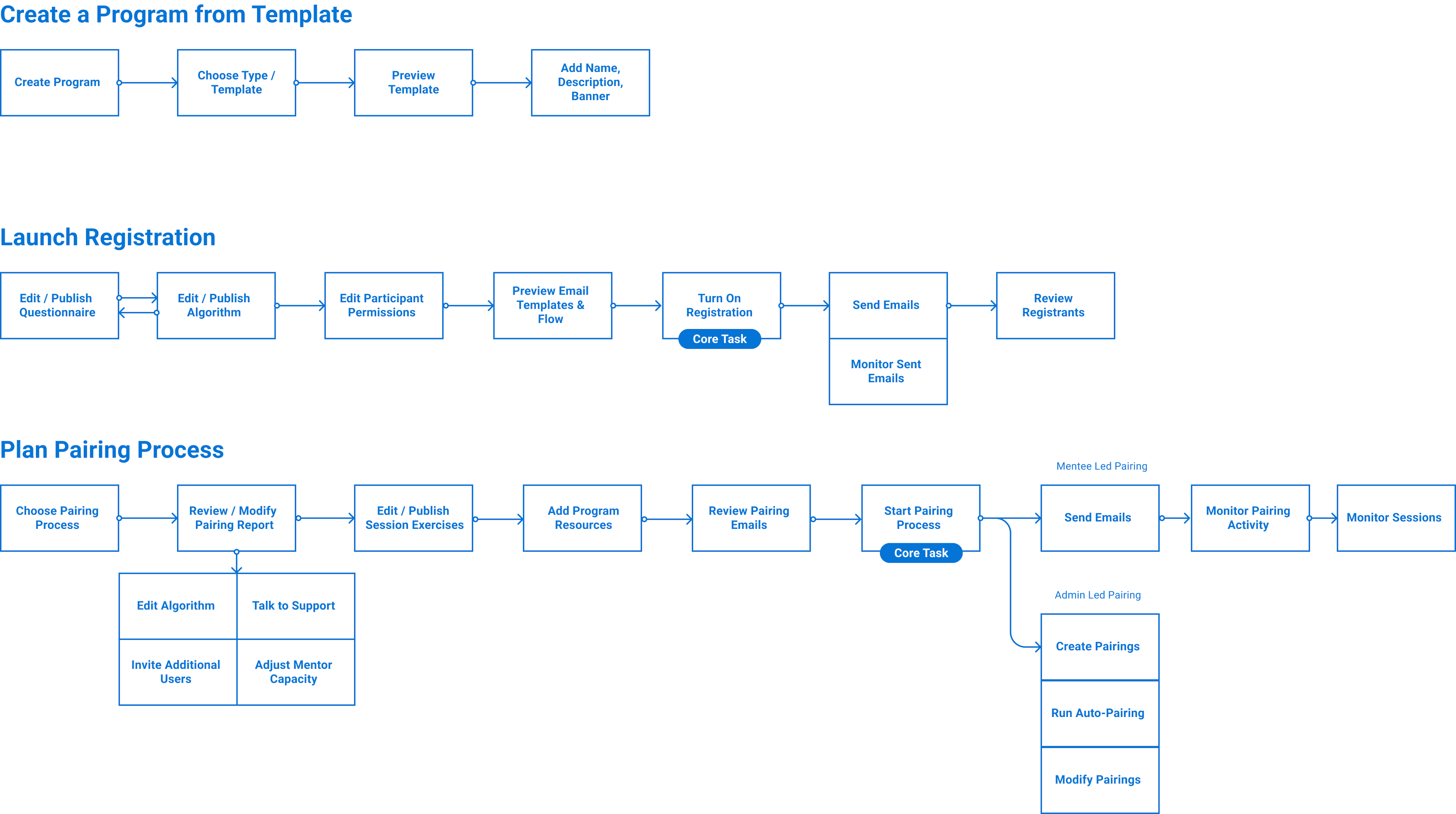
Pt 2/ Program Creation Wizard
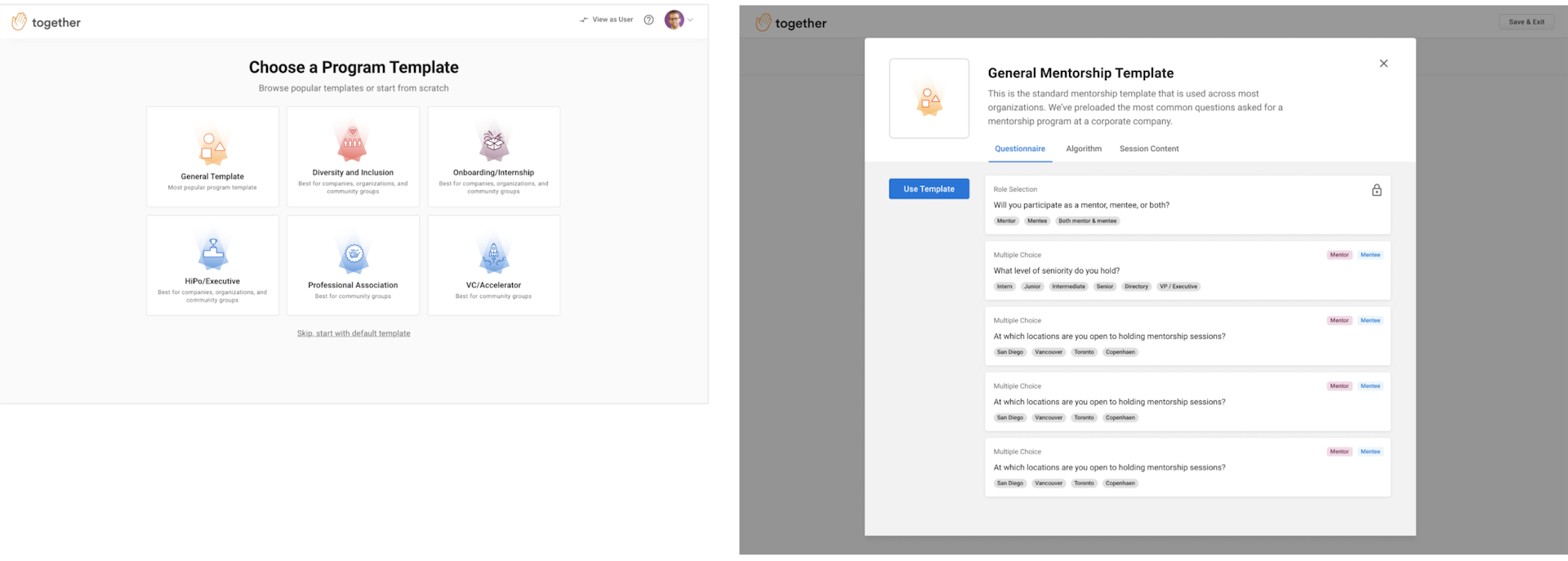
- Admins can explore templates based on common use cases
- Admins can view questions, algorithm rules, and suggested content
- Admins can choose a template to get started, or build their own from scratch
We explored and tested different patterns in user tests. We tried out explorations where admins would select specific bodies of questions based on what they wanted to ask participants. We found that admins didn't really know what they wanted, so would choose all the questions they saw. This would have lead to a poorer user experience, with long questionnaires, so we chose to have default "out-of-the-box" program templates.
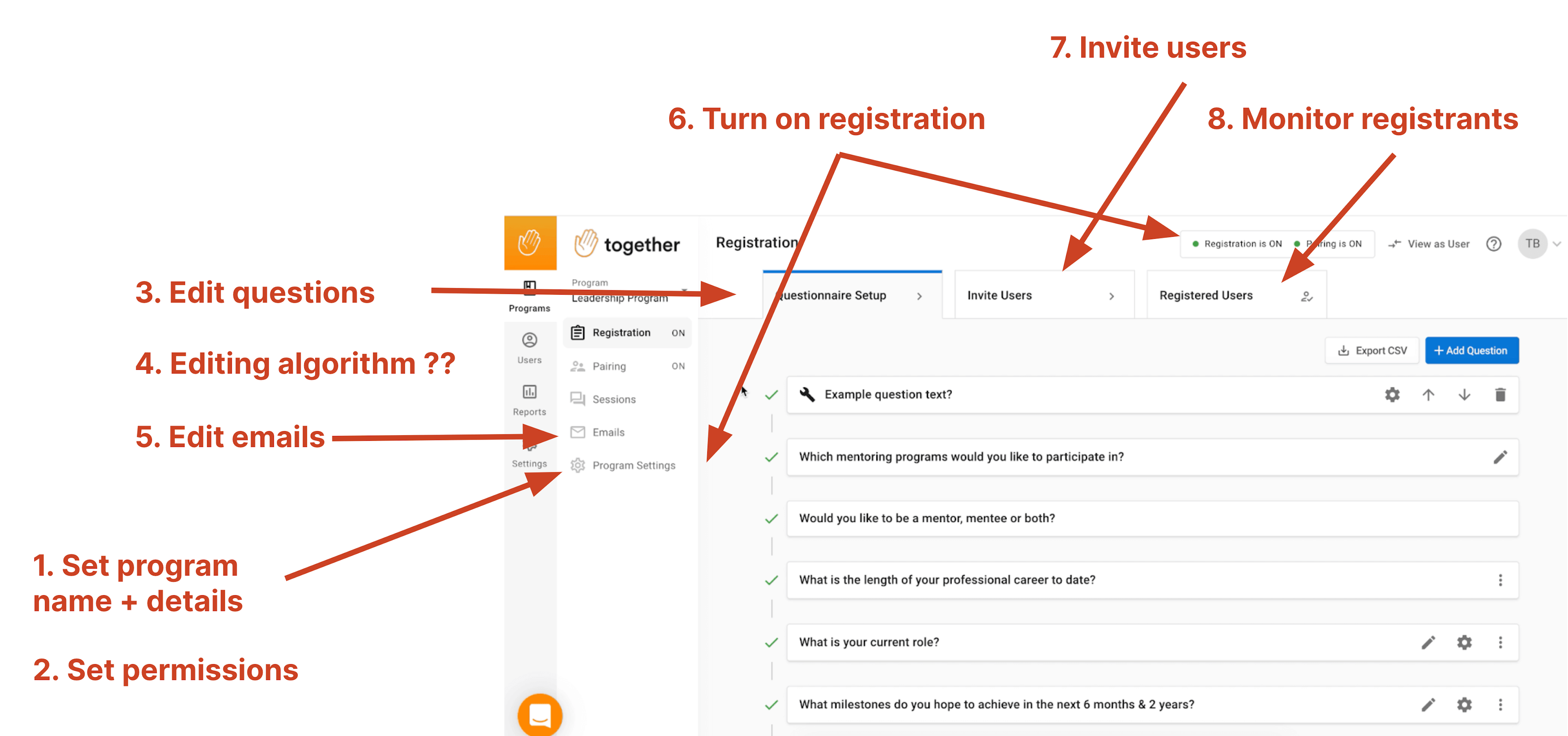
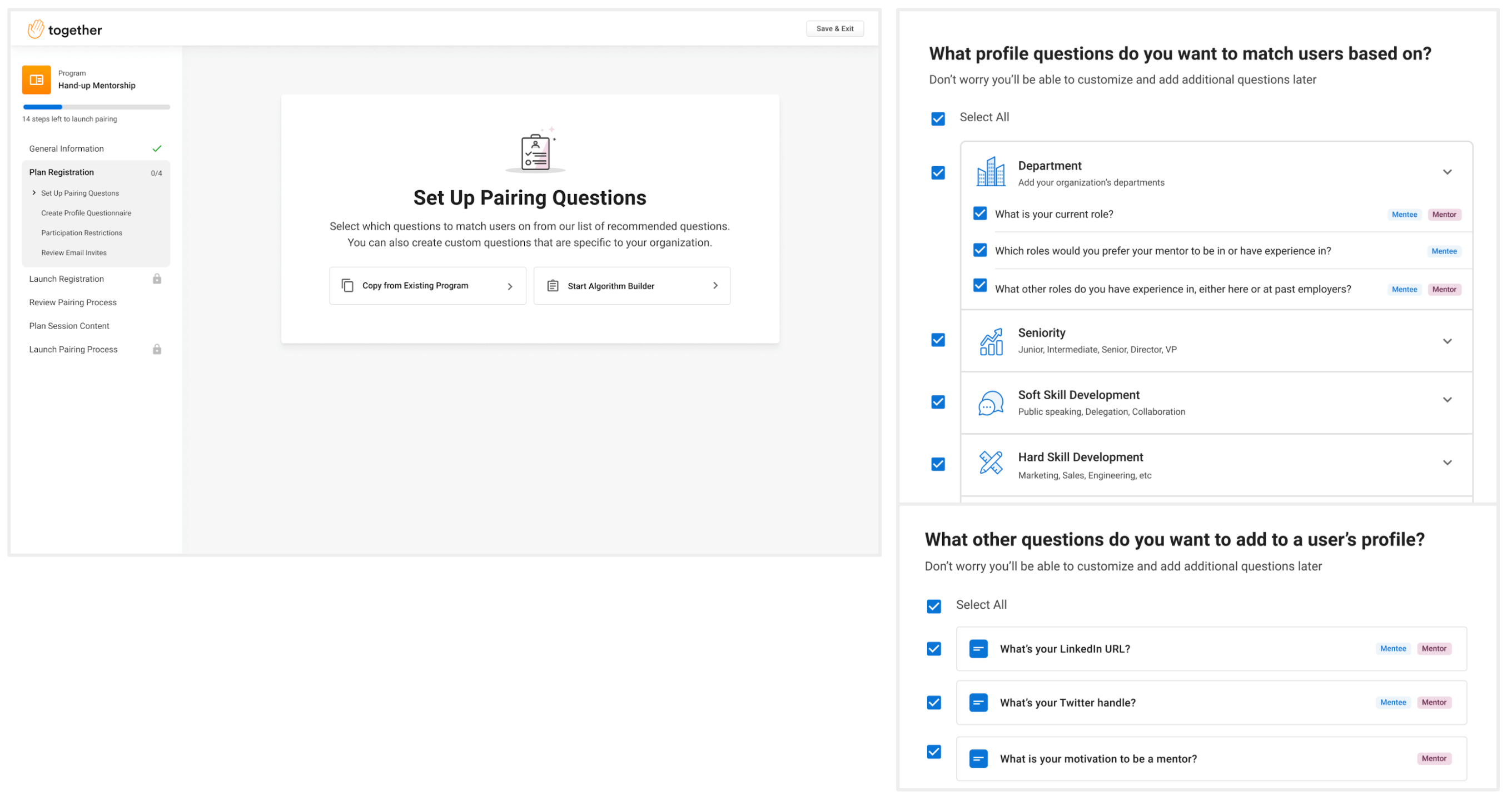
3/ Registration Wizard
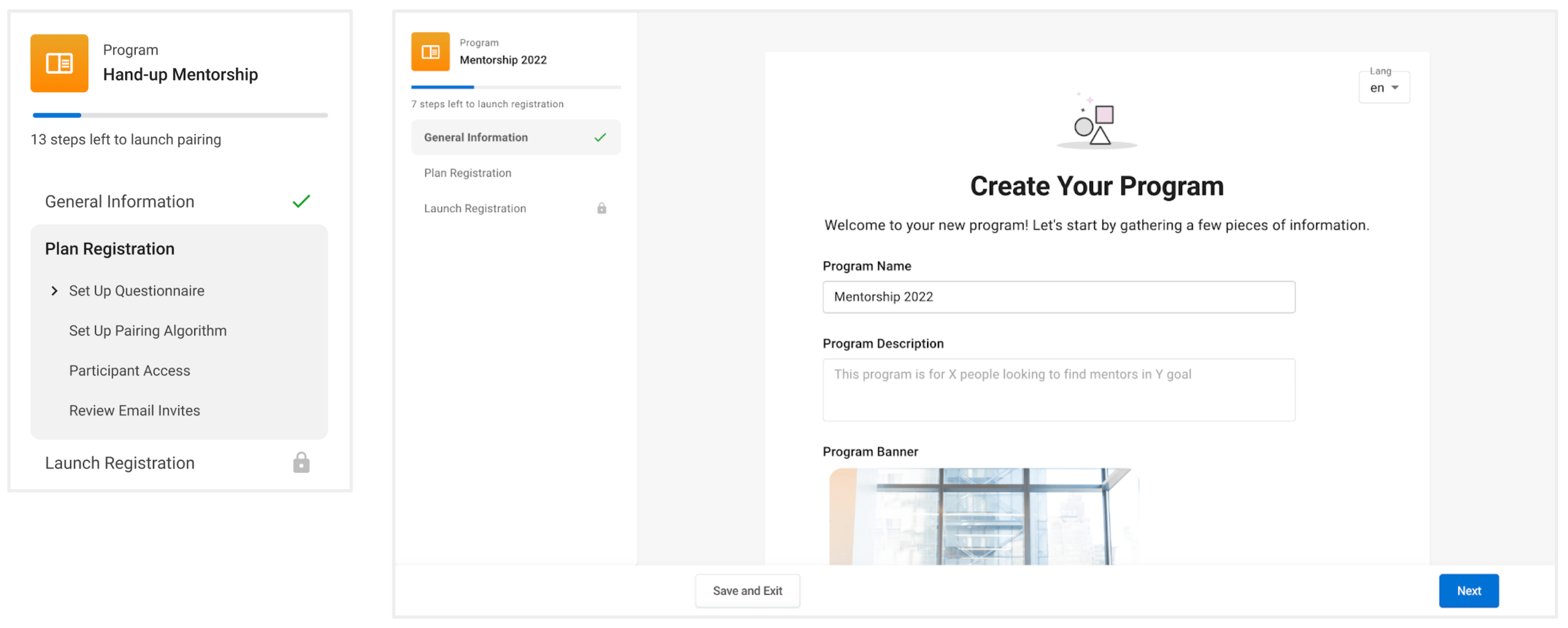
- Admins can view all necessary steps to launch program registration in a linear view, but can also navigate to different steps ad-hoc
- Admins can see their progress, and understand which steps they've completed, and which steps need to be completed
- Admins can save their progress, and complete their registration in a follow up session, starting back where they left off
We considered looking at flexible horizontal tab patterns, and setup stepper patterns. We tried a few different mixes, but felt the linear flow pattern worked best.
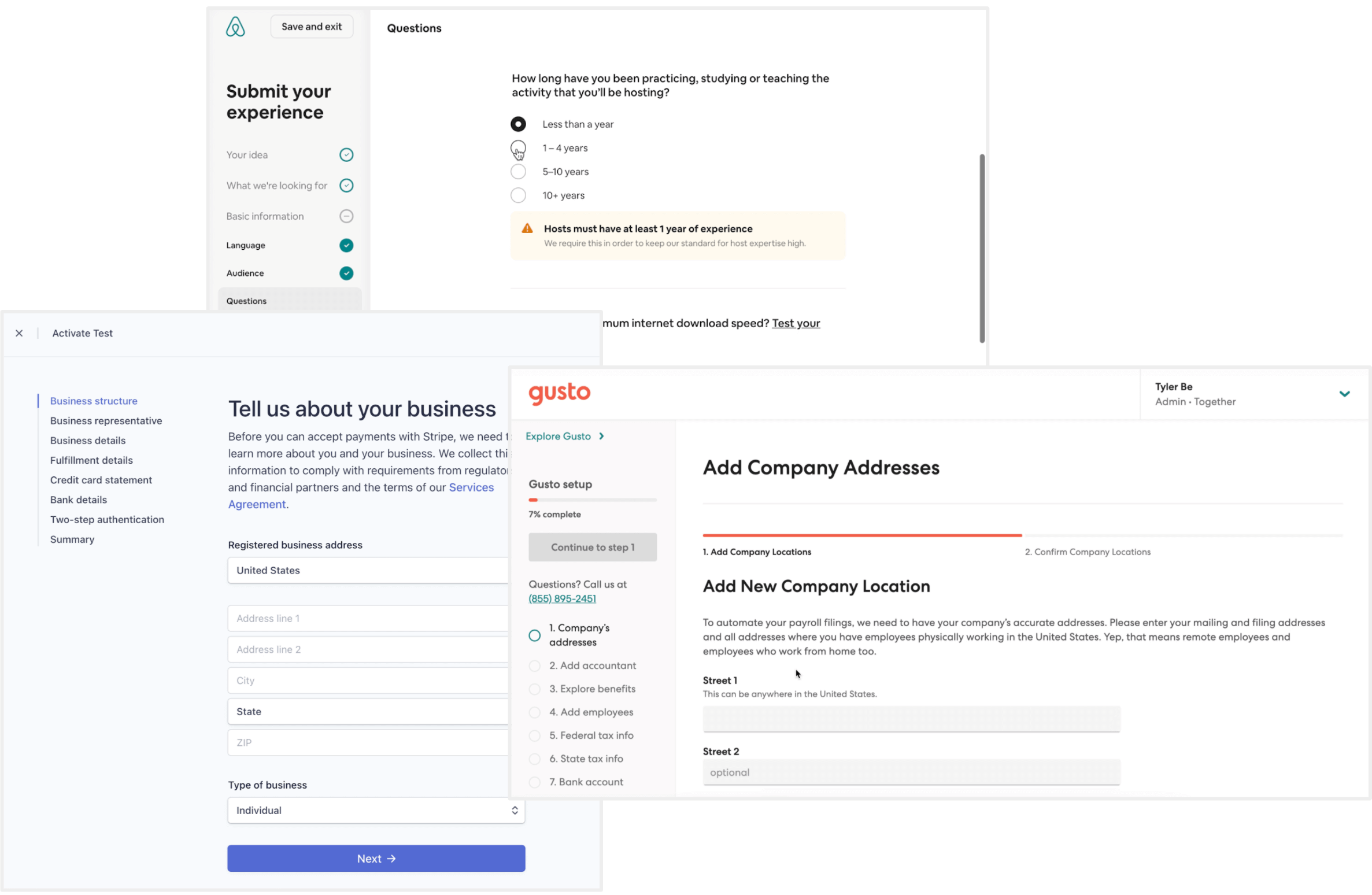
We liked the wizard pattern with a sidebar to show progress for a few reasons:
- We'd seen something similar from Stripe, Gusto, AirBnb for inspiration
- It is a good way to show progress for a large task, often over multiple sessions
- Keeps users focused without distracting navigation in new context
- Allows for chunking of information / progressive disclosure
- Re-usable across our app!
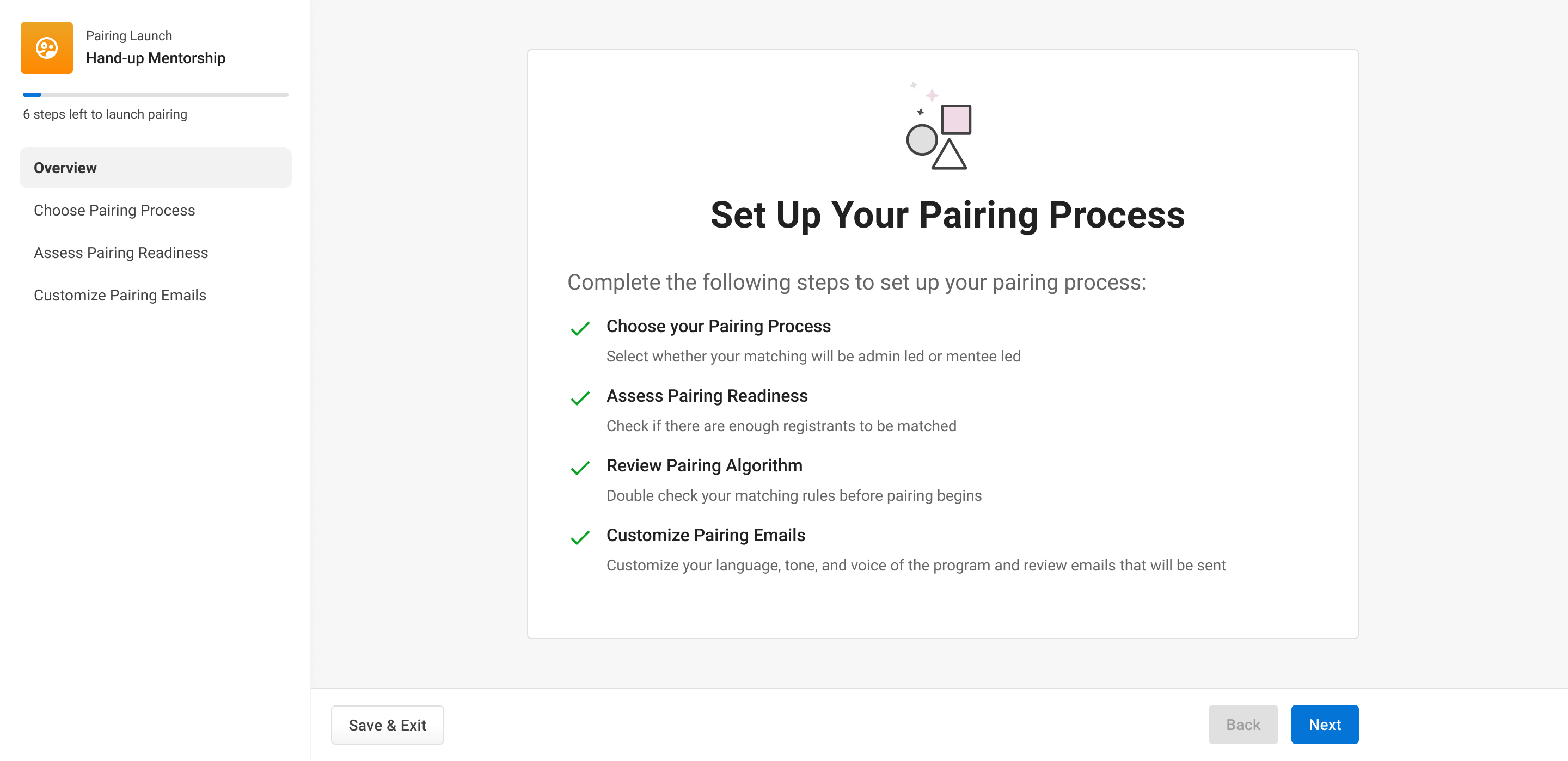
4/ Pairing Wizard
We reused the registration wizard pattern for the pairing process as well. It helps users since they're familiar with how it works, and also good for our small development team to reuse this pattern.
These 4 parts made up the foundation for the project that we would work on. We didn't have all of the designs done, but had a good overview for how this entire project would work together. We felt confident enough to rescope, put together a Product Requirements Doc and continue designing more key elements of the design.
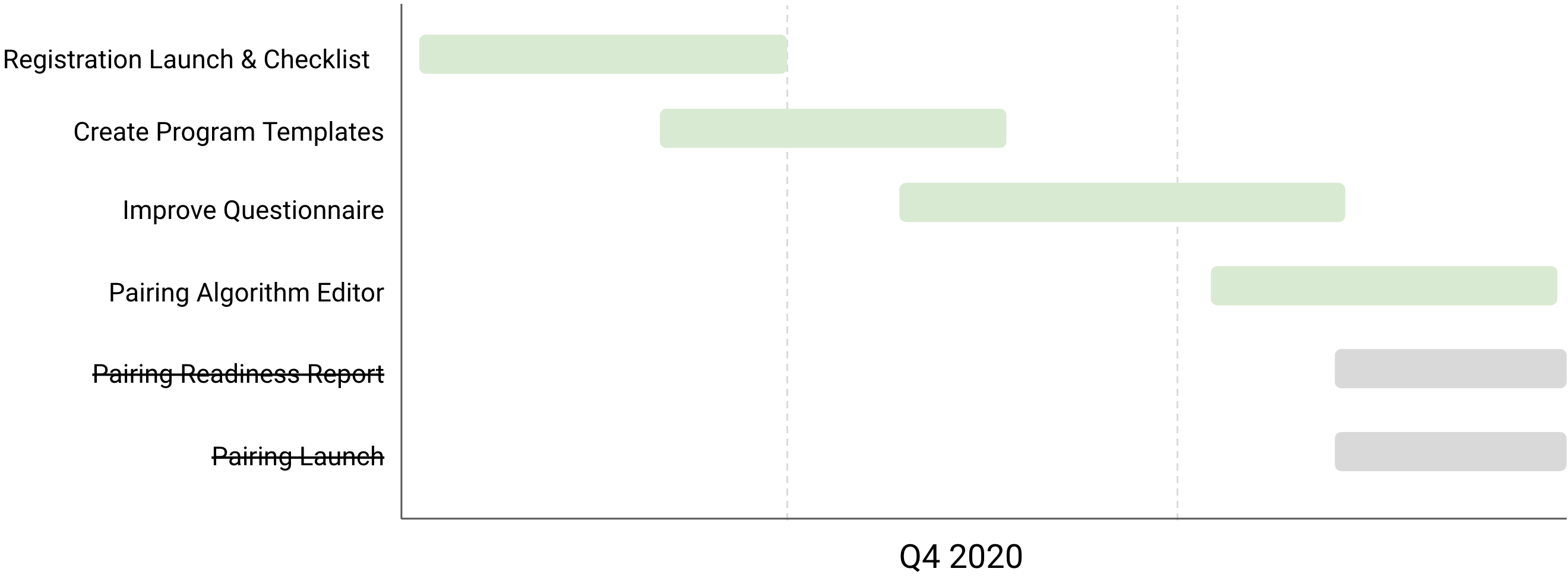
We scoped out initial projects as follows:
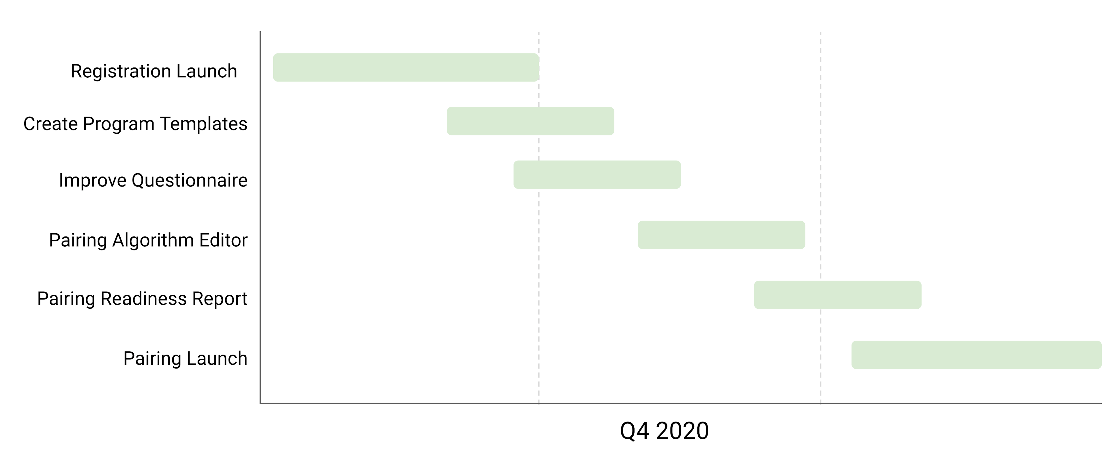
Delivery
While the high level system was worked out, we needed to prioritize what to build and when. This is where the discussion began around making tradeoffs and prioritization.
First thing we did was push the pairing process projects to the following quarter. We focused on the pieces that would help admins to launch registration to their program, therefore helping admins to commit to the program launch and avoid procrastination. Once they launched registration, they'd have to launch the rest of the program.
User Testing
The change in timelines also allowed us to spend a bit more time usability testing our designs with fresh administrators, while the engineers worked on building the designs. We booked 5 calls with new and existing admins, and tested our designs.
Key changes included:
- Improved UX copywriting to make tasks clearer
- Rearranging the order of the flow based on users' mental models
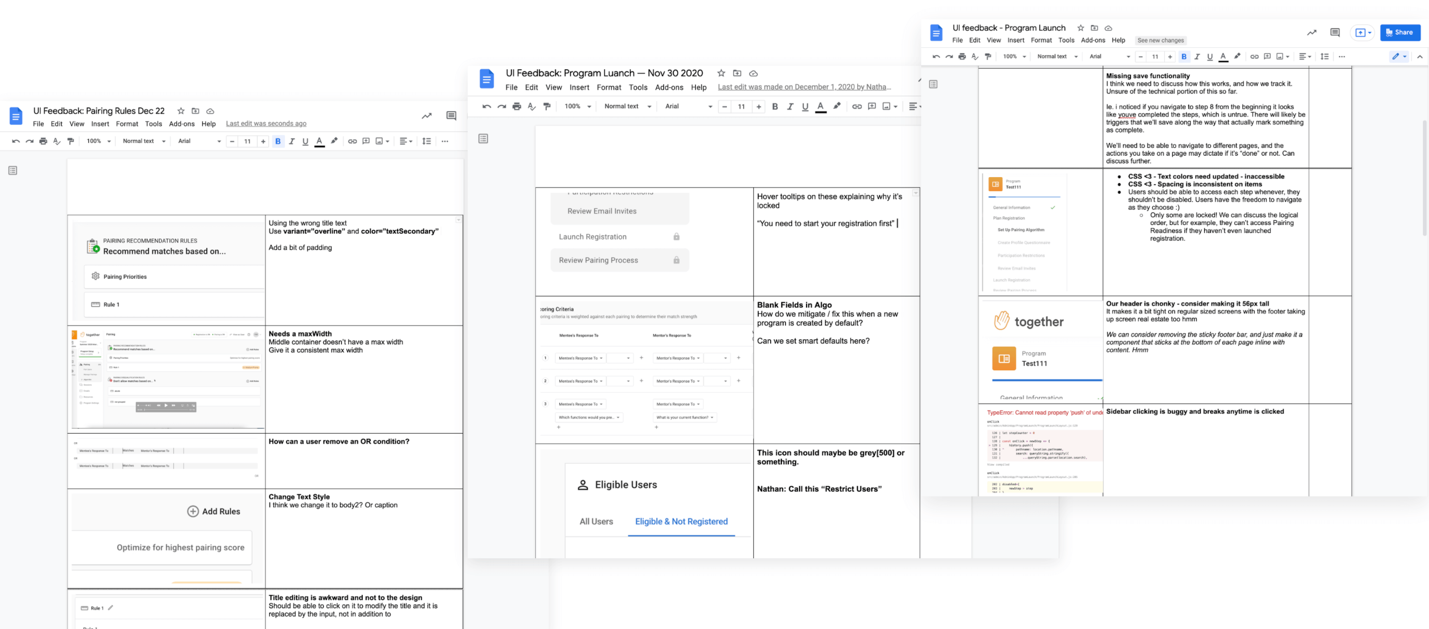
UI Feedback Docs
I've made a habit to write up feedback docs with screenshots of what needs to be fixed while engineers write code. I'll often write pseudo code or help the developers by referencing props that need to be changed on components, or sending links to components from our front end library — we use the MUI library for our frontend, and I'm quite comfortable with the tooling and documentation! I'll usually do this before anything is shipped. I probably wrote 5-10 of these docs over the course of the project.
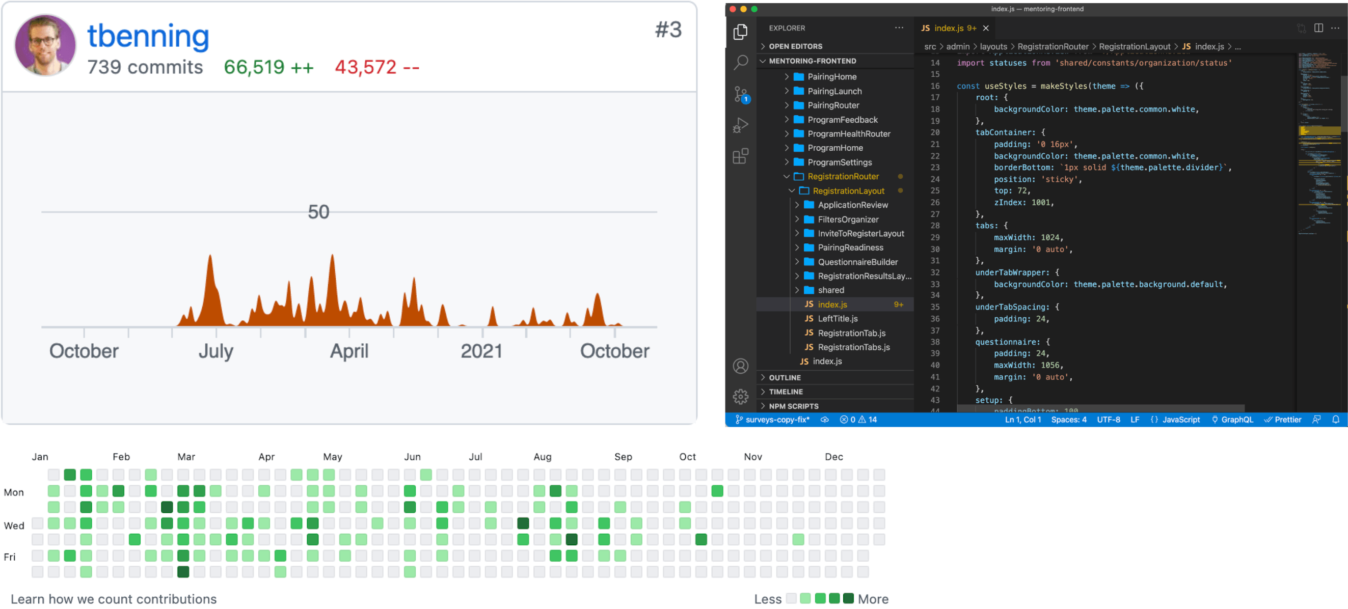
Collaborating in Code
When time allows, I like to help speed up delivery timelines by writing front end myself, or doing the fit & finish directly in the code myself. I probably submitted 5-10 PRs during this project to help out at various points.
After We Shipped
We shipped our projects incrementally, had admins use our new features, and got feedback as we went. We tweaked and modified things that were confusing, or edge cases we'd missed. Overall, we learned a lot about the impact we were able to make months after the projects. The project was successful in many regards.
Impact
After we'd wrapped Q4, we spent Q1 working on Pairing Projects. We continued to do more discovery research, and increased scope on new problems we learned about in the discovery process. I could tell you more about this, but that's a whole other tale!